Tuesday 29 March 2011
Audience Feedback
Today, I got audience feedback on the two magazine covers which are shown in one of my previous blogs. I printed the two magazines off which had the different focal images and ask a class of 13 which they preferred and they all preferred the picture with the medium close up, therefore I will be using this magazine for my final magazine.
Monday 28 March 2011
The Development of my Magazine cover

At the moment I am in the process of creating my magazine, I have a basic structure to my magazine however, I know that the focal image is an important convention of a magazine. Therefore, I have two drafts which I have done using different images to see which I prefer. I will ask a few people which they prefer.
Personally, I prefer the top magazine, I think that all the conventions stand out much more with this image, the image has been edited on photoshop and I edited the eyes to white to add to the effect of death. The colours are much more prominent for this magazine and the medium close up is on of the convetions which I noticed that many other Film magazines use.
However, I like the other magazine aswell, I like the picture and the layout, the head overlapping the title makes the magazine more professional and show my capablity to edit on photoshop.
 However, I think that this magazine does not stand out mas much as the focal image uses dull colours and I don't think it stand out as much in contrast to other magazine I have seen.
 The structure of the both magazines are the same however I have just inverted the colours to make then stand out against the background colour.
These magazines are unfinished at the moment, as I need to add more text and stand heading to make the magazine more stereotypical. I just wanted to contrast the two magazine to see which I prefer, this is one level of editing which I wanted to show, which shows the process of the development of my magazine.
Sunday 27 March 2011
Questionnaire for my trailer
Questionnaire for trailer
My trailer is finally completed, as part of my primary research, I will carry out a survey asking my target audience their opinions of the trailer we have created. I would like the know my target audiences opinions and comments on whether the trailer fits the category of a professional trailer, as that was our aim when producing the trailer.
I will ask 10 people this questionnaire and then analyse the results. I would like to film peoples reacts and comments as part of my research.
1. From Watching the trailer, ‘The Innocent’ what genre do you think it is?
2. From watching this trailer, would you pay to see the movie?
3. What was your favourite part of the film trailer? (you can tick more than one)
4. What part of this trailer created the most tension?
5. The font on the trailer was specifically chosen to fit the genre. Do you think that the font does that?
6. After watching this trailer, resemble a professional trailer?
Yes No
And
What elements of the trailer are the most professional? (you can tick more than one)
7. From watching the trailer what do you believe the storyline is?
8. What part of the sound did you prefer?
9. If you saw a poster or magazine cover of this trailer would you be more influenced to watch it?
10. Any other comments...
Tuesday 15 March 2011
Sound for Film Trailer
Today’s lesson we spend out time in the recording studio at school. We had another student help us record the sound which we would include in our film. My partner was the person which we recorded and I helped with the cutting on the tracks. The parts which were recorded were a heavy breathing, two screams and dialogue.
Before going to the recording studio, we created a script of what we wanted in our trailer. The dialogue was short, we wanted short sharp sentences to create suspense.
This was the dialogue we used:
“We were alone. Just me and Annie. Why did it happen?... That was the last time I saw her.”
The rest of our music, such as the back ground music we got from as copyright free website:
The rest of our music, such as the back ground music we got from as copyright free website:
http://incompetech.com/m/c/royalty-free/
Monday 14 March 2011
Film Poster
Final Poster
· I wanted the poster to be aesthetic– this will give attention to the poster and delivering the message to the audience. The messages should portray that genre the movie is going to be.
· The poster is focused– It only have one message, it is simple and communicates one message. The black and white portrays the horror/ thriller genre of the movie, this perhaps suggests death and supernatural through just the colour. Overall there is one focal image, which is mysterious, this leaves the viewer asking questions and wanting to see the film when it is released.
· I believe that my poster is ordered and organised– the simplicity should be obvious to the audience and clear for them to read and understand. The Large Heading, is the title of the movie, I wanted the font to be large and clear so it is a signifier for the poster. Another prominent convention is the focal image, it is clear and large, it stands out and stands out the most from the other convention. The Colour scheme is black, white and red, by using these colours they portray danger, death and superstition. The writing on my poster is mainly red, this red stands out and gives the reader in hierarchy of information.

This is my completed poster for my film. This would be one design which would be used to advertisers my Movie Release. After researching into recent film posters I used similar convention to represent a poster which would be used. The conventions which I considered vital for advertisement were, The film title, The date of release or ‘coming soon’, a focal image, Actors names, Film Website, and directors and editors in small print.

At the bottom, right of my poster I included the restriction of my film, it states that ‘Under 17 requires accompanying by an adult guardian’ This was a convention which was appropriate for a poster and is a legal requirement for higher rated movies.

Tuesday 1 March 2011
Photography for Magazine and Film Poster
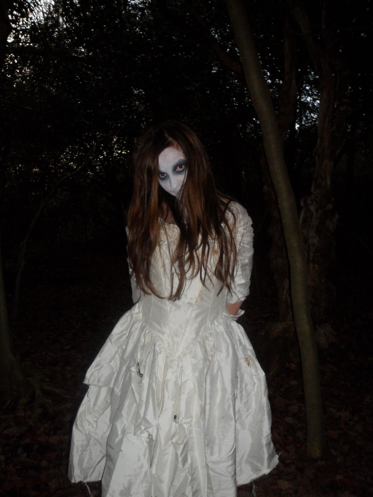
 The photogrpahy was done on a different day to our filming. We went to Sutton Park, with our costumes, make-up and props and done the photogrpah. I look different photos, changing the style such as I varied the angles and shots, I also experimented with using flash and not using flash to get as many photogrpahs as i could. I had a large variety of photogrpahs which I could choose from.
 This image I wanted her to look scary, and almost scratching her nails into the tree, however I don' think this image work that well, the lighting and angle was apropiate for my magazine or poster.
 This image is similar, again I wanted her to scratch her nails into the tree however, this image isn't very scary. I don't think it works well at all. For this image I didn't use flash and it worked quite well however I don't like the positioning of the model.


Front Cover Comparison DRAFT!

Film Magazine Front Cover
After surveying my target audience on what title they would prefer for a Film Magazine, these were the results
Feature Film = 9/15
Insight = 6/15
Therefore the next level of my prject was to choose the masthead, considering that if I was going to amge this a monthly issue that this would be my brand recognition therefore, it would have to stay the sample, for my audience to recognise it.
These are different fonts and styles which I experimented with, to see which I prefered.

Total Film Magazine Front Cover analysis

Sky line
The skyline is the text which is above the mast head. ‘From Batman to star wars: The 50 must-see movies for summer!’ This text stands out, this convention is important as it lure the audience to read it. The use of Bold, Capital Lettering attract the reader but also though the stars illustrating that this is a key feature to the magazine. The star logo is used several times on this cover.
Masthead
The masthead is the brand recognition. If this issue was monthly, the mast head would stay the same. Through using an identical masthead in every issue, this is the brand recognition for this ‘total film’ this is because it allows the audience to recognise the magazine.
Pug
The pug attracts the audience to buy the magazine as it states a feature of the magazine which will make the audience want to buy it, this convention highlights a important part. This is shown through the circle with key information which entices the audience. By using the colour red, it is bold and contrasts with the background, green on the colour spectrum.
Slogan
For this magazine in particular the slogan changes in each issue, this would be so that it matches the theme of the magazine cover, the slogan for this issue is to do with the focal image which is for the film, 'Charlie and the Chocolate Factory' the slogan for this issue is 'The Ultimate Movie Magazine' and other issue say for example, 'The Modern Guide to Movies' and so on.
Sell lines
This convention focuses on what the magazine includes. Through including sell lines on the cover, this lures the audience in, in a way in which it highlights the best parts of the magazine which may be some of the reviews which are featuring in the magazine.
Barcode
The barcode is the place where the price is normally placed. The position of the barcode is hidden, this suggests that it is a less important convention of the magazine. However, this is a necessary part of the magazine as it is used to scan the magazine, when sold.
Colour Pallet
For the colour scheme, They have concentrated on my target audience. This magazine is aimed at both male and female and therefore they have chosen colours relevant to both sexes. (Red, Green, Purple, White)
I believe that colours of this magazine relate to the genre of the film which is the focal of the front cover a.k.a Charlie and th Chocolate Factory, the film is a happy, funny film and therefore the colour are bright. The colour pallet is important for a magazine because by using the right colours, and contrasting them, it makes my magazine more attractive to the target audience.
Anchorage Text
This part of the cover, strikes the audience the most. The anchorage text connect to the focal image, this lures the audience in as it is almost of a subtitle, a description for the focal image. The anchorage text always uses a catchy short phrase such as ‘Ultimate summer preview’ this is brief but is straight to the point. The main text is in bold and uses capital letters.
Film Magazine Reasearch
Movie Magazine research
As part of my project, the brief includes producing a magazine front cover advertising the film my partner and I have produced.
From my research I have found two popular magazines which specify in new film releases. The two magazines are Total film magazine and Empire.
Empire Magazine
Empire is a British film magazine published monthly by Bauer Consumer Media. From the first issue in July 1989, the magazine was edited by Barry McIlheney and published by Emap. Bauer purchased Emap Consumer Media in early 2008. It is the biggest selling film magazine in Britain, consistently outselling its nearest market rival Total Film and is also published in Australia, Turkey and Russia. Empire organises the annual Empire Awards which were sponsored by Sony Ericsson until 2009 and are now sponsored by Jameson. The awards are voted for by readers of the magazine.
Total Film


Total Film is a British film magazine published 13 times a year which is every four weeks, by Future Publishing. The magazine launched itself in 1997 and offers film, DVD and Blu-ray news, reviews and features. It is one of the largest circulation English-speaking film magazines in the world. Guest editors have included Peter Jackson, Kevin Smith, and Ricky Gervais and Stephen Merchant.
As part of our course we have to produce a magazine cover featuring the movie we are creating. I thought it was relevant to do my own primary research on what people who like to see on the front of a movie magazine, therefore I did a small survey asking people who were my target audience.
I also noticed some of the conventions which stood out to me when I was analysising each cover of the Total Film magazines.
After Looking at them, I thought that the main conventionw which I would like to include on my Magazine are the Lure, and Sell lines and Masthead, from look at the Total Film magazines, these are the convention of the magazines which stood out to me the most.

These three images, show the Lures which are included on the Total film magazines. They are from different magazines, however I think this will be part of my inspiration when producing my magazine front cover. I will produce something similar to lure my target audience.
After analysing my audiences feedback, I then thought it would be appropriate to create another survey, asking my target audience what title they preferred for a movie magazine. Therefore, chose a few ideas for my title and surveyed my target audience to see what they preferred. This was the outcome:
· FEATURE FILM
· INSIGHT
These are the two titles which I prefer, as an apprieciate title. I'll ask around my target audience to survey which title they prefer.
Subscribe to:
Posts (Atom)